Bootstrapping, Monte Carlo and all that… — Part2
In the previous post we discussed why and when we need to use Monte Carlo simulations.
In this post I will try to use Monte Carlo methods to perform time series forecasting of monthly cloud fraction available from the climate model CESM 1.2 - CAM 5.3 simulations over the Indian region.
Time series forecasting is probably the most challenging and equally fruitful technique to make intelligent and scientific predictions from a time series data. (Larsen 2016; Ocean 2017). A time series data has many facets to it such as the trend, seasonality and some residue/remainder. These three components are usually there in case of a real-world data. We will talk about all these things in a separate post. So let’s start the analysis!!
First we will read the data, average spatially over Central India and try to plot the daily time series of cloud fraction.
import cdms2, pandas, numpy, cdutil
from calendar import isleap

f = cdms2.open('CLDTOT_AMIP_1979_2000_mon.nc')
data = f('CLDTOT')
print data.shape
## (8030, 192, 288)Central India is approximately 20N to 28N and 74E to 86E.
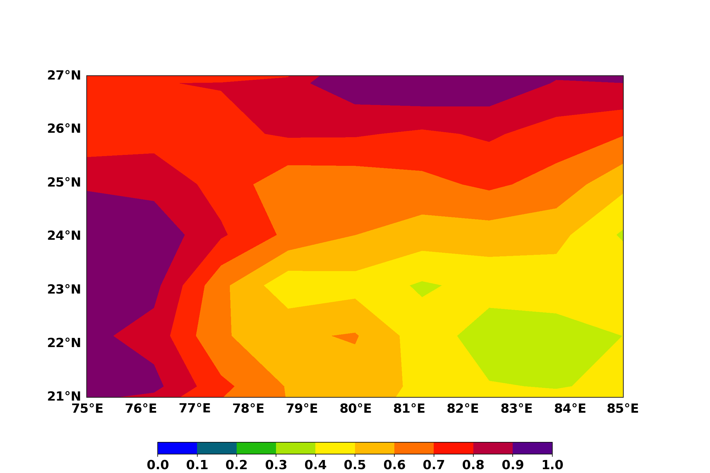
data_cent_india = data(latitude=(20,28), longitude=(74,86))Let us visualize one time slice to check the region.
import matplotlib.pyplot as plt
import numpy as np
from mpl_toolkits.basemap import Basemap, maskoceans
import nclcmaps as ncm
import cdms2
from matplotlib import ticker
import matplotlib as mpl

data_sel = data_cent_india(time=("1980-08-15","1980-08-15"), squeeze=1)

lat = data_sel.getLatitude()
lon = data_sel.getLongitude()

lons, lats = np.meshgrid(lon, lat)


cmap = ncm.cmaps('BlGrYeOrReVi200')

my_dpi = 96
vmin = 0.
vmax = 1

fig = plt.figure(figsize=(1200./my_dpi, 800./my_dpi))
map1 = Basemap(resolution='c',projection='cyl',llcrnrlat=21.,urcrnrlat=27.,llcrnrlon=75.,urcrnrlon=85.)

map1.drawparallels(np.arange(int(21),int(28),1),labels=[1,0,0,0], linewidth=0.0)
map1.drawmeridians(np.arange(int(75),int(86),1),labels=[0,0,0,1], linewidth=0.0)datapc = map1.contourf(lons, lats, data_sel, vmin=vmin, vmax=vmax, cmap=cmap, latlon=True)
fig.tight_layout(pad=6,w_pad=6, h_pad=8)
v=np.arange(0,1.1,0.1)
bounds = [0, 0.1, 0.2, 0.3, 0.4, 0.5, 0.6, 0.7, 0.8, 0.9, 1]
norm = mpl.colors.BoundaryNorm(bounds, cmap.N)
ax2 = fig.add_axes([0.05, 0.04, 0.9, 0.025], aspect=0.03)
cb = mpl.colorbar.ColorbarBase(ax2, cmap=cmap, orientation='horizontal', norm=norm, spacing='proportional', ticks=v, format="%.1f")
tick_locator = ticker.MaxNLocator(nbins=11)
cb.locator = tick_locator
cb.update_ticks()
plt.show()
Cloud fraction over Central India 1980-08-15.
Now let us create the spatial average time series and visualize it.
import pandas,matplotlib
import matplotlib.pyplot as plt
import matplotlib.dates as mdates
import matplotlib as mpl

plt.rcParams["legend.fontsize"] = 25
mpl.rcParams['xtick.labelsize'] = 20
mpl.rcParams['ytick.labelsize'] = 20

plt.style.use('fivethirtyeight')
dates = pandas.date_range(start='1979-1-1', end='2000-12-31', freq='D')

leap = []
for each in dates:
    if each.month==2 and each.day ==29:
        leap.append(each)

dates = dates.drop(leap)

cf_time_series = cdutil.averager(data_cent_india, axis='yx')
cf_series_numpy = numpy.array(cf_time_series)
df_series = pandas.DataFrame(cf_series_numpy,index=dates)
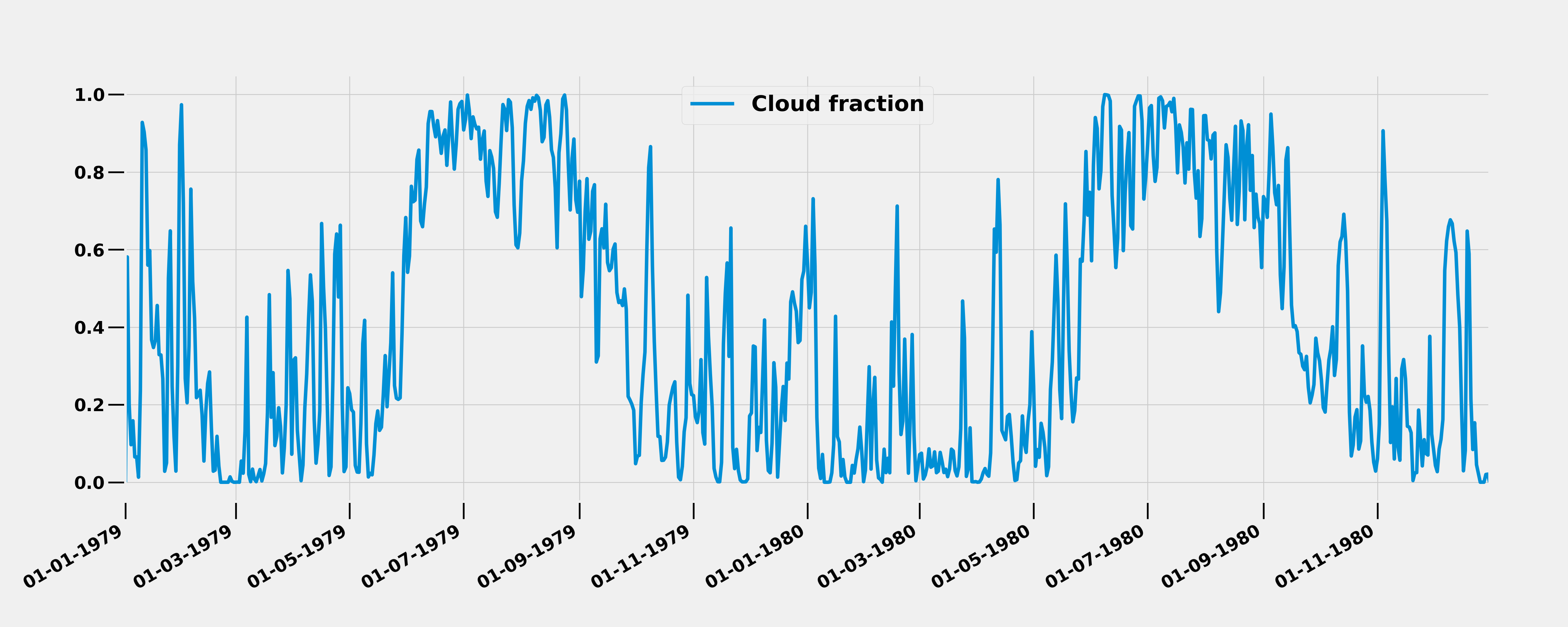
Let us plot 2 years of daily time series (1979-1980).
df_sel = df_series['1979-01-01':'1980-12-31']
df_sel.columns = ['Cloud fraction']
#df_sel.plot(figsize=(25,10))
#plt.show()


# convert date objects from pandas format to python datetime
index = [pandas.to_datetime(date, format='%Y-%m-%d').date() for date in dates]

ax = df_sel.plot(figsize=(25,10))
# set monthly locator
ax.xaxis.set_major_locator(mdates.MonthLocator(interval=2))
# set formatter
ax.xaxis.set_major_formatter(mdates.DateFormatter('%d-%m-%Y'))
ax.tick_params('both', length=20, width=2, which='major')
# set font and rotation for date tick labels
plt.gcf().autofmt_xdate()
plt.show()
From the time series, we see that there is a maximum of cloud cover over the Central India during June-July-August-September (JJAS) season which is the core monsoon season indicating high amount of deep clouds with larger spatial cover.
To use Monte Carlo methods, we will use a python package called prophet. This package uses Markov Chain Monte Carlo method to perform forecasting (Ocean 2017). For more information on the package, please refer to (Research, n.d.).
import pandas
from fbprophet import Prophet
import matplotlib.pyplot as plt
import matplotlib as mpl
mpl.rcParams['xtick.labelsize'] = 10
mpl.rcParams['ytick.labelsize'] = 10
plt.style.use('fivethirtyeight')

df_series.columns = ['Cloud Fraction']

df_series['Days'] = dates
print df_series.head(5)
## Cloud Fraction Days
## 1979-01-01 0.000000 1979-01-01
## 1979-01-02 0.580835 1979-01-02
## 1979-01-03 0.201555 1979-01-03
## 1979-01-04 0.096733 1979-01-04
## 1979-01-05 0.158427 1979-01-05print df_series.dtypes## Cloud Fraction float64
## Days datetime64[ns]
## dtype: objectProphet also imposes the strict condition that the input columns be named ds (the time column) and y (the metric column), so let’s rename the columns in our DataFrame:
- (Ocean 2017)
df_series = df_series.rename(columns={'Days': 'ds',
                        'Cloud Fraction': 'y'})

print df_series.head(5)
## y ds
## 1979-01-01 0.000000 1979-01-01
## 1979-01-02 0.580835 1979-01-02
## 1979-01-03 0.201555 1979-01-03
## 1979-01-04 0.096733 1979-01-04
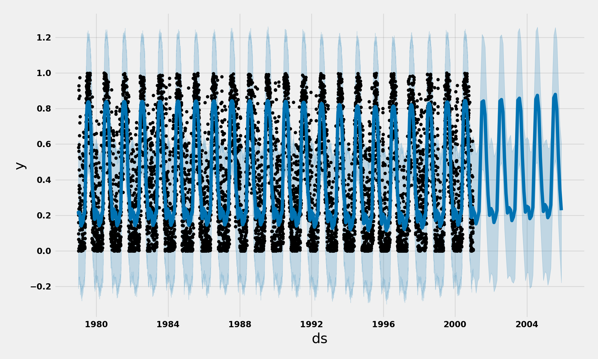
## 1979-01-05 0.158427 1979-01-05Let us visualize the forecast for the time series for next 5 years i.e. from 2001-2005.
# set the uncertainty interval to 95% (the Prophet default is 80%)
my_model = Prophet(interval_width=0.95, daily_seasonality=True)
my_model.fit(df_series)
future_dates = my_model.make_future_dataframe(periods=60, freq='MS')
future_dates.tail()forecast = my_model.predict(future_dates)
print forecast[['ds', 'yhat', 'yhat_lower', 'yhat_upper']].head()my_model.plot(forecast,uncertainty=True)
plt.show()
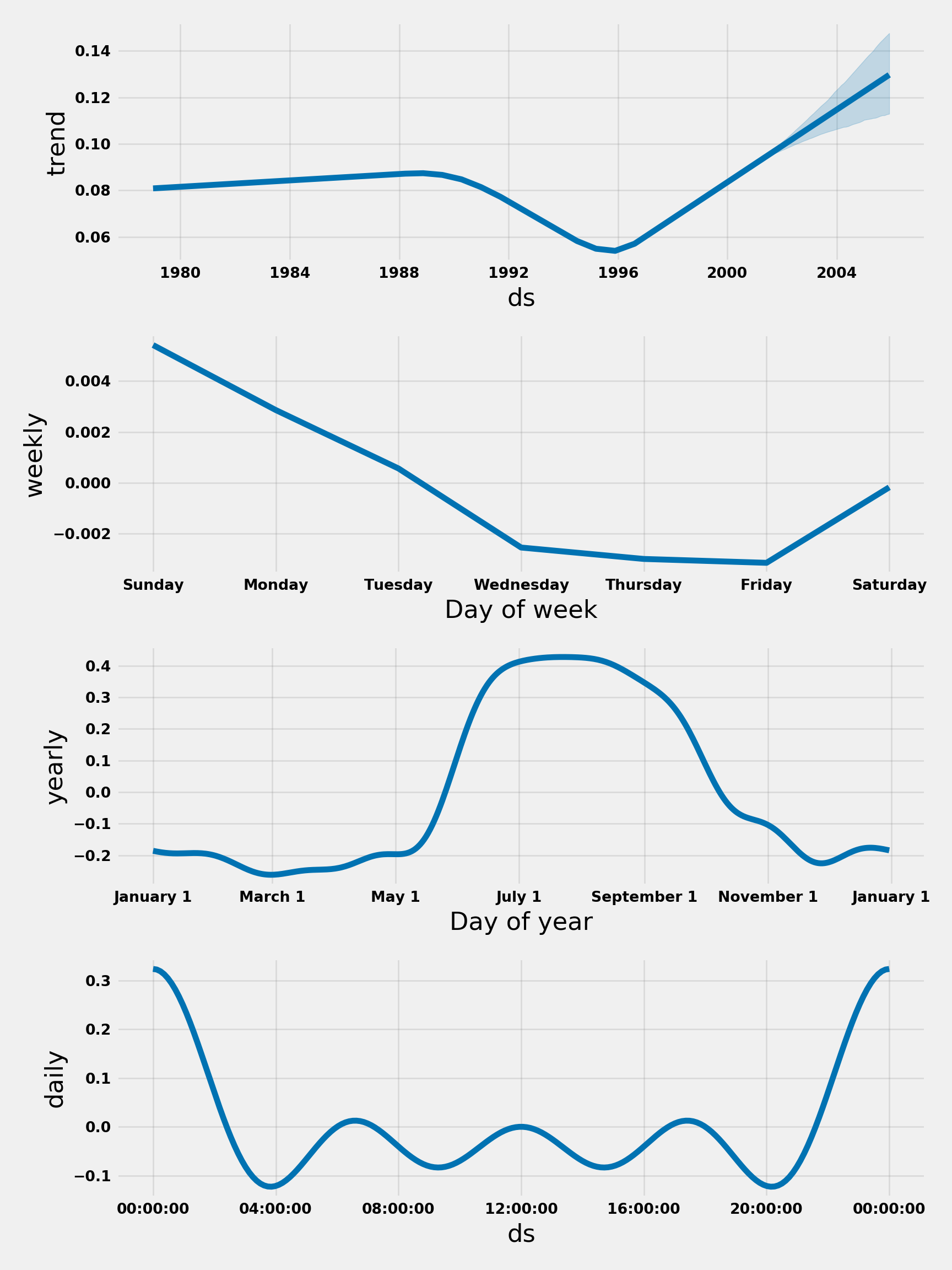
Prophet also has the capability to analyse and present the components of the forecast such as trend and seasonality.
my_model.plot_components(forecast)
plt.show()
References
Larsen, Kim. 2016. “Sorry Arima, but I’m Going Bayesian.” Multiple Hypothesis Testing | Stitch Fix Technology – Multithreaded. https://multithreaded.stitchfix.com/blog/2016/04/21/forget-arima/.
Ocean, Digital. 2017. “A Guide to Time Series Forecasting with Prophet in Python 3.” SQLite Vs MySQL Vs PostgreSQL: A Comparison of Relational Database Management Systems | DigitalOcean. https://www.digitalocean.com/community/tutorials/a-guide-to-time-series-forecasting-with-prophet-in-python-3.
Research, Facebook. n.d. “Prophet: Forecasting at Scale.” Facebook Research. https://research.fb.com/prophet-forecasting-at-scale/.